
Yes, that is one of my gem sets. Nice colour. Perfect in fact. Thanks
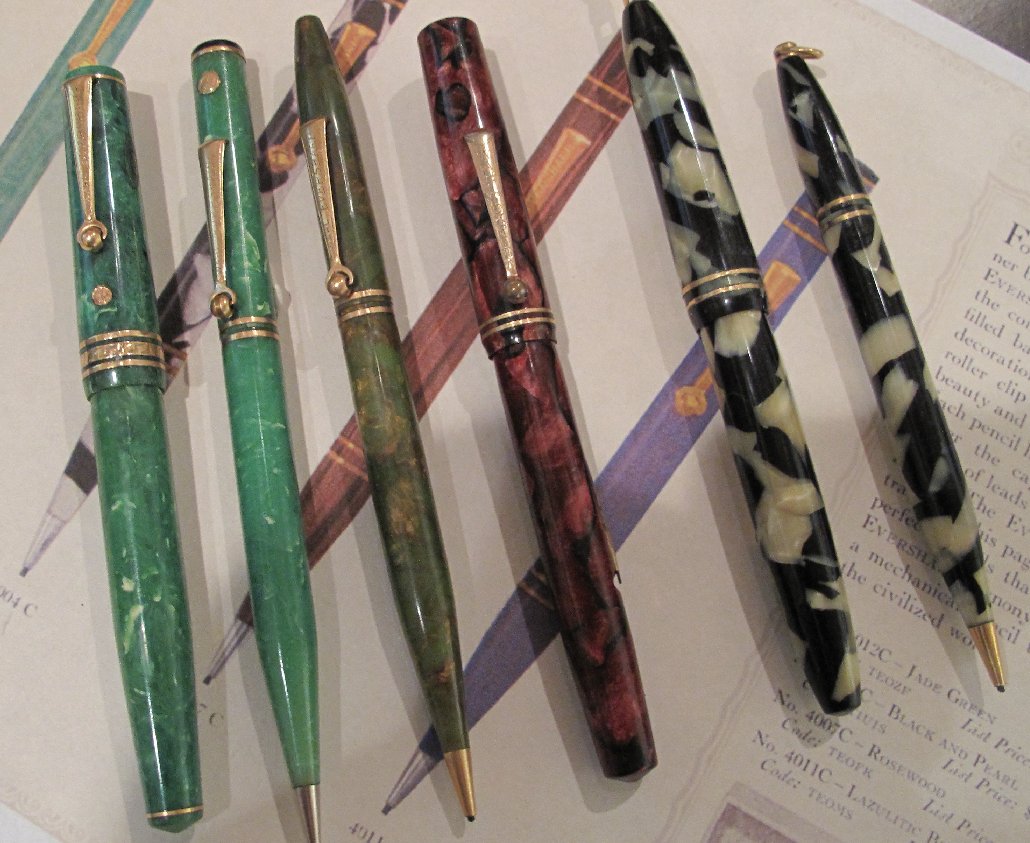
Just a few of my Equi- Poised pens and pencil to add to the eye candy. My jade pencil has a gold seal which I think they normally do not have. The bronze green pencil is fitted with blue lead which I have not seen before and my Wahl Oxford pen is I think the same colour as your jem Tunis which I am happy to say is in perfect condition.
You don't even mention the black & pearl set, which is just stunning! Great stuff, there.
Tim

First Year Wahl-Eversharp Equipoised....
Started by ihimlen, Dec 30 2011 02:01 PM
24 replies to this topic
#21

June H
-

- Members
- 220 posts
journeyman
Posted 06 January 2012 - 06:11 AM
#22
David Nishimura
-

- Members
- 701 posts
journeyman
Posted 07 January 2012 - 01:34 AM
Okay, I have a question; so do you think the change in the design was a result in cost cutting measures, and also it facilitated the lawsuits and such in order to make a slight change? Gosh, i see this all the time with watches.
Rolex tried to do this to Seiko in the early 1980's. Rolex has their famous two tone Datejust, real gold/steel. Seiko made one in quartz but plated, but the same "grains of rice" band, fluted bezel, 36mm dial, etc. but of course 1/10 the price at the time. Two years and millions in legal fees and Seiko won.
Cost-cutting surely wasn't the motivation for the design changes. The changed designs wouldn't have provided any savings in materials used, nor in machining time. And the changes would, of course, have cost money in terms of altering tooling and the need to stock at least minimal quantities of parts for repair of "old" models.
I'm not familiar with the Rolex-Seiko litigation, but in the case of the Sheaffer Balance, there was a design patent granted. Not only that, but the design was distinctive and quite unlike anything previously made. I would have been very leery about going head-to-head with a copycat design under those circumstances. I do note that according to Roger, the company that attempted to challenge Sheaffer's design patent did so by claiming prior art, but I've got to say that while pens prior to the flat-top era did often have rounded ends, their profile was very much of their era, and not at all comparable to the Streamline aesthetic of the Balance. This also applies to early pens with tapered bodies, which were more an emulation of Victorian dip pen tapers than Machine Age design avant la lettre.
And a quick query to Roger, following up on David I.'s:
Do the litigation records actually omit the name of the company that was in litigation with Sheaffer over the Balance design patent?
And a side note regarding the collecting of Equi-Poised pens:
This really is an undervalued model -- produced for a rather limited amount of time, and in the middle of the Great Depression. The oversized pens, in particular, are quite scarce, far less common than the oversized flat-tops ("Deco Bands") that preceded them. Twenty years ago, they were valued on a par with Patricians, over $1000 for a clean one. Back then, I don't recall there being much of a premium attached to the early versions, but certainly with the knowledge disseminated since, there ought to be, as they are again much less common than the later design.
Finally, a note regarding how closely the first two Equi-Poised designs resemble the Sheaffer Balance:
While the proportions of the truncated version of the Balance-like Equi-Poised do indeed more closely correspond to those of the Balance as produced, the Balance design patent illustration shows a design decidedly more pointy at the ends -- much closer in profile, in fact, to the pointy-ended Equi-Poised listed in the 1929 Wahl-Eversharp catalog than to the production Balance. I would also think that the "truncated Balance" profile (of what I believe to be the second version of the Equi-Poised) might also have offered a defensible way to get around the Balance design patent, in that that patent showed a profile that curved smoothly to a rounded end, whereas the Wahl design incorporates a discontinuity, with the smooth curve ending in a more conical end.
#23
david i
-

- ADVISORS
-

- 7,515 posts
ADVISOR
- LocationEast Coast USA
Posted 07 January 2012 - 03:50 PM
SNIP
And a quick query to Roger, following up on David I.'s:
Do the litigation records actually omit the name of the company that was in litigation with Sheaffer over the Balance design patent?
SNIP
I hope Roger will address. Suspect he is saving the info for something a bit bigger than this thread, which is fine but in which case... I hope he actually gets around to that project.
And a side note regarding the collecting of Equi-Poised pens:
This really is an undervalued model -- produced for a rather limited amount of time, and in the middle of the Great Depression. The oversized pens, in particular, are quite scarce, far less common than the oversized flat-tops ("Deco Bands") that preceded them. Twenty years ago, they were valued on a par with Patricians, over $1000 for a clean one. Back then, I don't recall there being much of a premium attached to the early versions, but certainly with the knowledge disseminated since, there ought to be, as they are again much less common than the later design.
As is often the case, Board threads evolve as they will, and this one started with first-style pens but has been seasoned with bit of general show-and-tell and with a smidge of model evolution discussion, and has been further spiced with hints of fresh historical information.
Now we swing into valuation.
How to compare and relatively value the different Equi-Poised is choice material, not simply addressed, and worthy of a focused thread.
A typical graph that tried to integrate each key variable into its own axis of course would not be visualizable to most of us who are not Stephen Hawking. Too many dimensions: historical import, color, size, rarity, cachet, anomalous status and so forth. Of course, one can simplify a bit

To address a couple notions raised, I very much agree that the OS "Type 3" pens (really the only ones done OS) are monsters that-- while not cheap for plastic pens-- are underpriced regarding most parameters that matter, save perhaps for the dominant, "current collector demand". I am personally fond of this cluster. Just four colors are catalogued, though at OS girth, two lengths of each are found depending on clip style. To me, these are more beautiful and better constructed than the generally recognized "biggest plastic pen of 1930"-- referencing price and general collector recognition-- the Waterman Patrician. The big Wahl is heftier pen and well more elegant-- though not more ostentatious-- than Patrician. Yes... subjective. And, there are cases in which variants from other brands from late 1920's-early 1930's top Patrician's prices today, but that's a thread for another time.
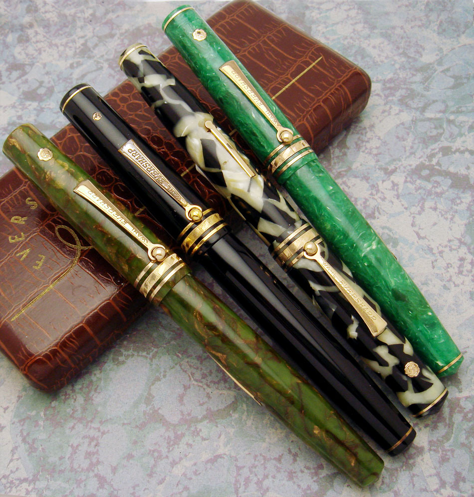
I don't hunt Equi-Poied in completist fashion, but I'd long wanted to grab all the side-clip OS pens. And, i favor pens with good preservation of color. I recently completed that set. None were bargains (seems rare to find ebay Equi-Poised bargains compared to finding such among other makes from the era, but even that reveals something about Equi-Poised's scarcity), but all were reasonable considering condition.
Here again (from last page) is that recently completed mini collection
But, how to rate/rank the Equi-Poised variants?
As was suggested throughout this thread, A hefty amount of evolution was crammed into about four years of production. The first year was overlapped by the still advertised flat-top family and the final couple years or so were overlapped by Doric. There probably was just a year or so when Equi-Poised ran alone as Wahl's only Gold Seal series.
Early pens have signficance for having started the series. The arguable "Type 3" pens such as seen in my shot of the OS pens, offered larger models which are relatively scarce. And, Type 3 offered colors not seen among the early pens. In the prior page of this discussion I showed a full size Tunis Type 3 pen. Tunis tends to be particularly hard to find clean. The plastic is chemically and physically more fragile it seems than some of the other colors. But Tunis was not made OS. How then to factor a hard-to-find-clean (maybe relatively scarce in any condition) standard Tunis vs the cachet of size found in other colors of that group or vs the historical significance of the early pens?
Then there is the arguable "Type 2" pen -- the modified flat top, semi-streamlined pen, "transitional"-- that by no means is proven to have come after the early Balance-like pens and in fact could have been far later product (eg. ends added to the last of the flat-tops to get rid of stock in 1935). They are more scarce than first style pens, and also offered colors seen in flat-top but not for other Equi-Poised, Lapis and Coral.
The final economy line style introduced in 1932-- the Type 4 pen-- offered Flamingo, a color which-- though catalogued for Equi-Poised-- has extra cachet due to its off catalogue appearance with some flat-top pens. Also, the Purse Pens offered some really bizarre colors, such as Canton Pearl.
Then there is the really off-the-mainstream stuff, the orange pens done we believe for Denmark and oddities such as the Lapis Type 3 pen I once saw on ebay but which I did not win.
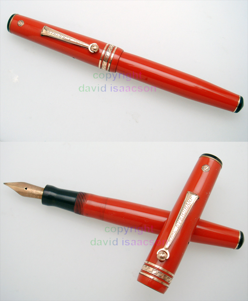
Here is an orange side-clip standard Equi-Poised in quite nice shape. I recall David Nishimura at least has handled this sort before.
As is often the case, those who play with this series have sense of value. It is more a gestalt thing-- as is often the case with old pens and with other collectables-- as few sit back and analyze five or more axes of information in discrete fashion to form a value.
Still, it could be productive to list the pens known, cite anomalous and speculated models, and to mark a couple key value points (rarity, cachet factor) for the pens. Might not be so hard to do, given the short run of the series and the limited palette used for many models.
regards
David
David R. Isaacson MD. Website: VACUMANIA.com for quality old pens with full warranty.
Email: isaacson@frontiernet.net

Email: isaacson@frontiernet.net


0 user(s) are reading this topic
0 members, 0 guests, 0 anonymous users

