Jump to content


Photo

Killer Sheaffer Balance from the Baltimore Pen Show


  • Please log in to reply
8 replies to this topic

#1 david i

david i

    ADVISOR

  • ADVISORS
  • 7,515 posts
  • LocationEast Coast USA

Posted 08 March 2013 - 02:18 AM

Killer Sheaffer 1930's Balance from the Baltimore Pen Show March 2013...or... Happy David.

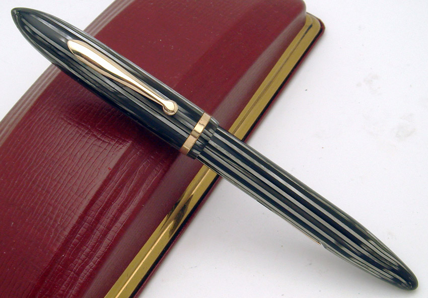
Picked this one up from Lisa and Brian. It is an interesting Balance, no doubt. Anyone care to hit the high points, or shall I... ?

Posted Image


regards

David
David R. Isaacson MD. Website: VACUMANIA.com for quality old pens with full warranty.
Email: isaacson@frontiernet.net

Posted Image

#2 sloegin

sloegin

    journeyman

  • Members
  • 285 posts

Posted 08 March 2013 - 04:25 AM

Reverse trim.

#3 david i

david i

    ADVISOR

  • ADVISORS
  • 7,515 posts
  • LocationEast Coast USA

Posted 08 March 2013 - 04:38 AM

Reverse trim.


Seemingly, as it has gold-filled trim on a Gray Pearl pen, though the context can get a bit muddled for this pen. Anything else?

regards

d
David R. Isaacson MD. Website: VACUMANIA.com for quality old pens with full warranty.
Email: isaacson@frontiernet.net

Posted Image

#4 sloegin

sloegin

    journeyman

  • Members
  • 285 posts

Posted 08 March 2013 - 04:54 AM


Reverse trim.


Seemingly, as it has gold-filled trim on a Gray Pearl pen, thought the context can get a bit muddled for this pen. Anything else?

regards

d


Not a clue. Could be the lack of white dot, could be size. Context does help.

#5 david i

david i

    ADVISOR

  • ADVISORS
  • 7,515 posts
  • LocationEast Coast USA

Posted 08 March 2013 - 05:02 AM

Not a clue. Could be the lack of white dot, could be size. Context does help.


The reverse trim does provide a strong clue about context. But, at least two more things are interesting about the clip on this standard size Balance...

regards

d
David R. Isaacson MD. Website: VACUMANIA.com for quality old pens with full warranty.
Email: isaacson@frontiernet.net

Posted Image

#6 Terry Brack

Terry Brack

    greenhorn

  • Members
  • PipPip
  • 10 posts

Posted 08 March 2013 - 06:19 AM

No Sheaffer imprint on the clip. Could it be 14K?

#7 gweddig

gweddig

    journeyman

  • Members
  • 128 posts
  • LocationNorthern CA

Posted 08 March 2013 - 06:19 AM

To me the taper looks longer than usual and the clip seems low, but I'm a novice at this kind of stuff.

--greg

#8 ihimlen

ihimlen

    Member

  • Members
  • PipPipPip
  • 41 posts

Posted 08 March 2013 - 12:23 PM

Anyone care to hit the high points, or shall I... ?


No high point brassing that I can see (kidding!) :lol: Anyhoo, though I'm not really a Sheaffer expert, I think I'll try my luck on this one.

Apart from the reverse trim, instead of the later Radius Clip, the pen has the earlier streamlined clip usually seen on the lower line Craftsmans/Juniors - however, in this case the clip has no Sheaffer'S [Jr.] imprint.

There is also a narrow cap band, no WD and probably a less hefty (5-30?) nib, so it means it was a higher model than the Craftsman but lower than Lifetime - almost like an oversized Craftsman :-)

The idea behind this model was obviously cutting the production costs a bit to get the price slightly down and the marketing target group were probably those customers that wanted full size 'lifetime quality pens' but wanted to save a few pennies (very wise considering the economic climate of the Great Depression).

I would suspect Eversharp did the same with the Popular Priced Doric - there were models with (catalogued) and without the Gold Seal....and Parker probably started the trend with its DQ models.

i.

Edited by ihimlen, 08 March 2013 - 12:24 PM.

Life is too important to be taken seriously
(Oscar Wilde)

#9 Teej47

Teej47

    journeyman

  • Members
  • 527 posts
  • LocationSpokane, WA

Posted 08 March 2013 - 05:00 PM

Must be Canadian.

Tim

:rolleyes:
The only sense that's common is nonsense...


0 user(s) are reading this topic

0 members, 0 guests, 0 anonymous users