Jump to content


Photo

A Tale of Two Pens.....


  • Please log in to reply
12 replies to this topic

#1 rpk1204

rpk1204

    journeyman

  • Members
  • 157 posts
  • LocationMinnesota

Posted 15 January 2014 - 02:41 AM

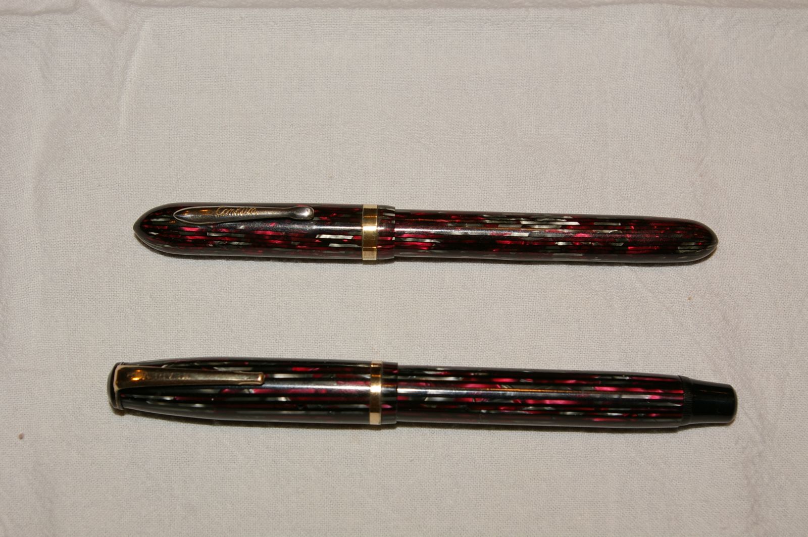
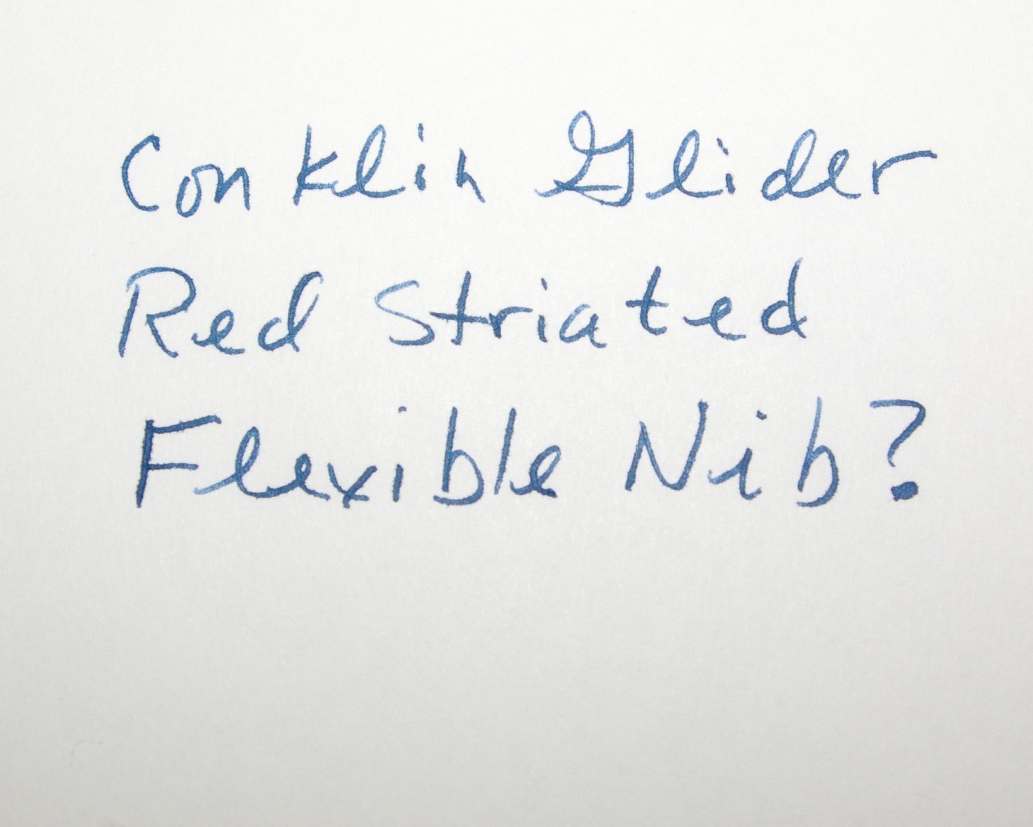
I acquired these pens somewhat together and of couse was immediately caught by the similiar / knock-off plastics.  On top, of course, is the beloved or at least well-regarded Conklin glider in the red striated pattern.  Below is the lowly and mostly shunned Wearever.  I restored these pens together and

I wish I had taken more pics, but it was an interesting experience. 


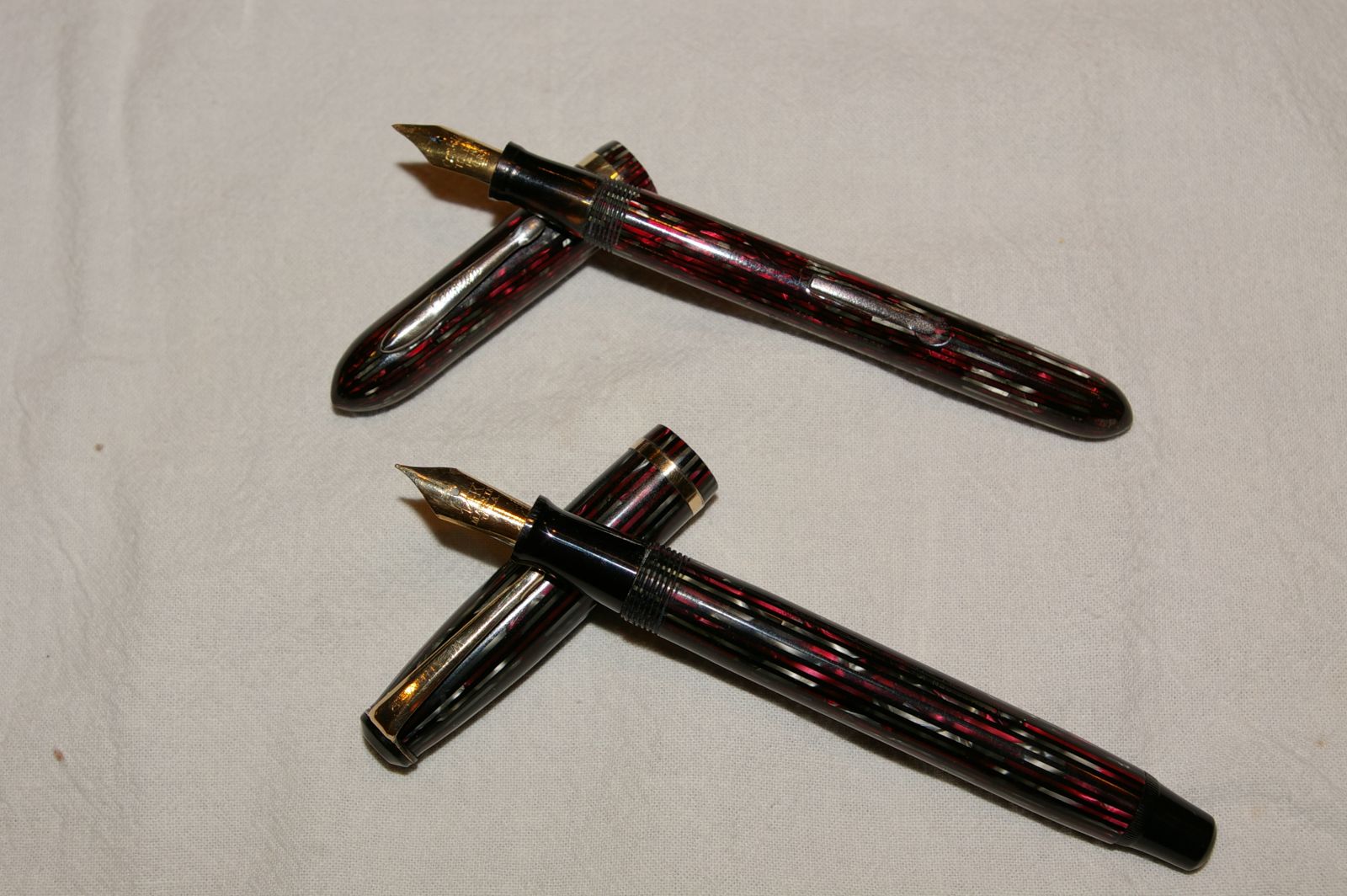
The Conklin, as everyone knows, has the easily and generally fully brassed hardware.  The Weareaver seems to have much more durable furniture.  On the restore, it was easy to see the Wearever had a much longer and grooved section to hold the sac - very nice touch. The Wearever also has a screw-out jewel making restore even easier. 


Upon re-assembly, the Wearever fit snugly on the first fit.  The Conklin needed a little extra help (a layer of shellac left to dry) to fit firmly back into the barrel.  The plastic on the Wearever feels much more solid.  Both have 14KT nibs, the Wearever having the neat clear plastic feed. 


I have yet to ink these and try them out, but it was fun doing them together and noting the differences.  Also wondered if Wearever could get by in today's world blatently knocking off the Conklin design. 


Enjoy!  Randy


gallery_71873_308_1102342.jpg

gallery_71873_308_1686538.jpg

gallery_71873_308_343176.jpg

gallery_71873_308_36541.jpg


#2 Widget

Widget

    journeyman

  • Members
  • 426 posts

Posted 15 January 2014 - 08:54 AM

I have never bought a Weareaver pen because everything I have read describes them as cheap and nasty.  If I was given the opportunity to chose 1 of the 2 pens above after reading description and studying pics I would chose the Weareaver.  As well as the brassing I don't like the look of the Conklin nib.


#3 rpk1204

rpk1204

    journeyman

  • Members
  • 157 posts
  • LocationMinnesota

Posted 15 January 2014 - 12:19 PM

There are certainly a gazillion cheap low-end Wearevers and other Kahn pens out there, but the Pacemakers and equivalents (this pen didn't have the Pacemaker name on it) with 14KT nibs do seem well constructed.  I will ink one of mine up and see how they write in comparison. 


#4 david i

david i

    ADVISOR

  • ADVISORS
  • 7,515 posts
  • LocationEast Coast USA

Posted 15 January 2014 - 12:43 PM

Discussions regarding quality aside, I admit the Wearever Pacemaker is not a bad looking pen, at least mint/tagged. ;)


weareversetsmall.jpg


regards


david


David R. Isaacson MD. Website: VACUMANIA.com for quality old pens with full warranty.
Email: isaacson@frontiernet.net

Posted Image

#5 Widget

Widget

    journeyman

  • Members
  • 426 posts

Posted 15 January 2014 - 12:57 PM

David I think that is a classy looking pen and without the clip markings I would never think Weareaver!!!


#6 Mike Hosea

Mike Hosea

    journeyman

  • Members
  • 135 posts

Posted 15 January 2014 - 02:52 PM

Also wondered if Wearever could get by in today's world blatently knocking off the Conklin design. 


The answer is "yes". Except where patents impinge, copying designs is even considered fair play in business. It's the patents that generate litigation.


Is the nib slit as far off-center as it looks on the Conklin?  Doesn't look like that nib will write.


Edited by mhosea, 15 January 2014 - 03:48 PM.


#7 rpk1204

rpk1204

    journeyman

  • Members
  • 157 posts
  • LocationMinnesota

Posted 15 January 2014 - 06:49 PM

Actually I think it is, I noticed it when I first got it then kind of forgot about it while I was doing the restore.  I'll ink it up and see what happens.  I'm not a nib guy, and I remember thinking to myself "Is this some kind of oblique or something..." lol.  I'll let you know what I find out. 


David thanks for sharing your nice stickered set.  I've got about 3 of these now and I think I'll try one for an everyday writer.  Nice thing is you can usually pick them up REALLY cheap.  The black one I have I got for a buck.  Plus I like button fillers for their cleaner lines (at least until I lose the blind cap).  


Randy


#8 Rick Krantz

Rick Krantz

    ADVISOR

  • Members
  • 910 posts
  • LocationEphrata PA

Posted 15 January 2014 - 10:56 PM

where's the duofold?


didn't they use the same plastics as well? 


#9 Rick Krantz

Rick Krantz

    ADVISOR

  • Members
  • 910 posts
  • LocationEphrata PA

Posted 15 January 2014 - 11:12 PM


Also wondered if Wearever could get by in today's world blatently knocking off the Conklin design. 


The answer is "yes". Except where patents impinge, copying designs is even considered fair play in business. It's the patents that generate litigation.


Is the nib slit as far off-center as it looks on the Conklin?  Doesn't look like that nib will write.


keep in mind, it isn't a knock off....


likely what happened is the material was phased out somewhere, and the conklin (chicago syndicate, likely at the time) bought some, and perhaps Wearever bought some more, or even the remnants. As per Al Kahn, whom I spoke with many times over the years, Wearever was making parts for all the pen makers, and it was a close community. Stuff got sold, traded, moved around, that's maybe to some degree why you see shared plastics across several companies. Probably the condensed version, but I certainly miss the information that guy knew. He is still actively selling on ebay, I see him on occasion at a local flea market, but not every sunday, like years past. 


#10 rpk1204

rpk1204

    journeyman

  • Members
  • 157 posts
  • LocationMinnesota

Posted 16 January 2014 - 01:11 AM

I love info like this, especially about people and what really went down.  Thanks Rick!


#11 rpk1204

rpk1204

    journeyman

  • Members
  • 157 posts
  • LocationMinnesota

Posted 16 January 2014 - 03:16 AM

OK, I inked both of them and tried them out.. The Wearever is a verrry smooth writer with what I would call a medium-fine point.  May have to cycle this in as a daily writer for a bit.  The Conklin - well it actually does write - without any unusual grip or angle.  That said, it is pretty scratchy and could definitely use either some tuning or maybe replacement.  It's got quite a bit of flex, and in my high-res images I noticed some damage on the section close to the nib.  Anyway, here are the writing examples... with my crappy handwriting. 


Randy


gallery_71873_308_531356.jpg

gallery_71873_308_384500.jpg


#12 Shadow Wave

Shadow Wave

    journeyman

  • Members
  • 167 posts

Posted 16 January 2014 - 05:08 AM

I have a Nozac pen/pencil set in this plastic pattern, so it was definitely in use by Conklin before the Chicago days.


Terminology question....


I was under the impression that the Conklin Gilders were from the Chicago production years, and are not well-regarded, except for the Toledo nibs. Or is this an all-Toledo pen (in which case, apologies)?


#13 rpk1204

rpk1204

    journeyman

  • Members
  • 157 posts
  • LocationMinnesota

Posted 16 January 2014 - 12:18 PM

I've had two of these and both Toledo nibs.  Must say the other nib was nicer.  I'm not sure how you tell if the rest of the pen is Toledo or Chicago.  I think I did read somewhere that some Chicago pens had Toledo nibs as they used them up.  I'm sure someone on here has the right answer! 


0 user(s) are reading this topic

0 members, 0 guests, 0 anonymous users